Pen and Ink & Values
|
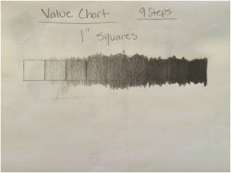
In my art two class we took the first few days to go over values which we learned in art one. The picture on the left is a nine step value chart with one inch by one inch squares. We learned that when you apply more pressure on the pencil then you'll have more of a dark value. Mrs.Rossi also wants us to be able to control the amount of pressure that we put on the pencil, so we can have even values.
|
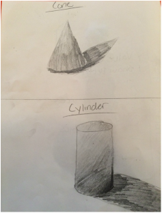
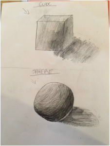
When we were done with the value chart, we applied the same principles to a few basic shapes. The arrows indicate where the light source was coming from. Once we were done with that we filled in the shapes with the correct values. A new thing that I learned with shading is that you have to shade with the direction of the shape. For example, with the circle you would make half circles that goes along the curves of the circle.
|
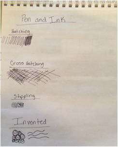

The next thing that we learned in pen and ink techniques. There are four different techniques that we've learned, hatching, cross hatching, stippling, and invented. To make those dark and light values it's not about how much pressure you put on the pen, it's about how much space you put between each line. To make a lighter value you put more space in between each line, but to make a darker value you would put less space in between each line.
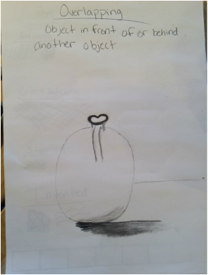
To put our skills to the max we did an overlapping practice. What we did was we put one random object in front of an other object random object. As you can see i didn't finish mine, but my two object were a glass mug and a lamp.
|
Unit 1 Project, Perspective
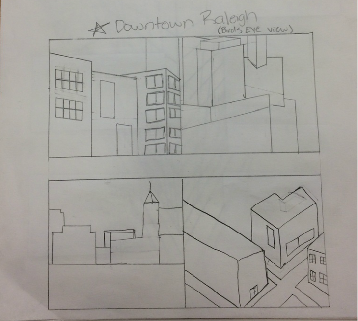
For our first project, we had to do a prospective drawing using a full value scale. My top two ideas for this project was Downtown Raleigh, and the track at my school. I ended up picking Downtown Raleigh because I think it's the best place to be and the best place to have a good time. Instead of drawing it in a two-point or one-point perspective, I decided to draw it in a birds eye view. Since i can't fly up in the air and take a picture in birds eye view I just used some photos from the internet. There were no pictures of a birds eye view photo on Downtown Raleigh, so I looked up some pictures of buildings in Downtown Raleigh and combined all the building that I saw to make one central area of Downtown Raleigh.
|
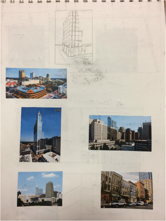
Here are my reference photos, as well and my compositional sketches.
|
|
The picture in the middle on the left is mostly what I went off of because its the closest thing I could get to a birds eye view.
|
After I did all of my sketches I was ready for my final sketch. I did a quick little sketch to visualize what I wanted my final project to look like. I didn't add to much detail to my final sketch because I wanted to work on my final project so I wouldn't be behind.
Down below is a quick slide show of some in-progress pictures I took while I was completing the project.
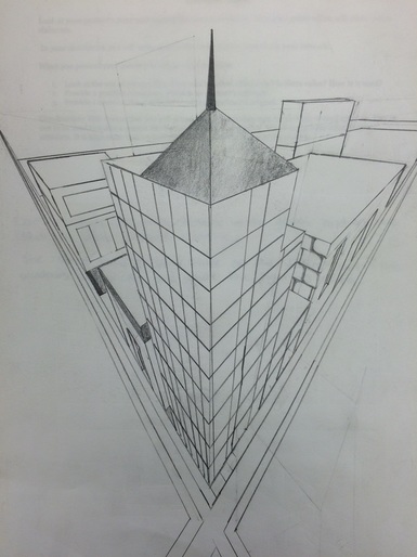
After a week of working on the project here is the piece.
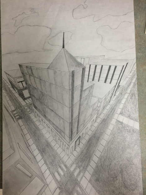
I'm really happy with the way it turned out. I made sure to really add values in there to give it depth. However, some advice I've gotten from some people are to add more shading to the clouds and maybe do a different texture with the grass. I did the grass kind of effortlessly because I had this big patch of white and I didn't know what to put there, so i decided to put grass there. The small little details made this project take forever, but it really help this piece look good.
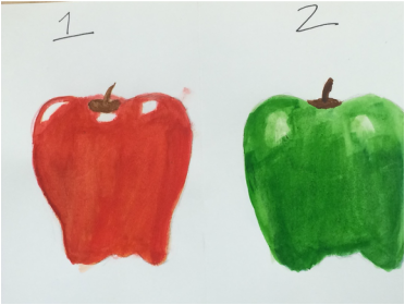
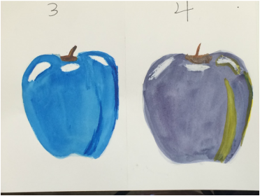
Watercolors, Oil/Chalk Pastels, and Colored Pencils
Moving on to our next unit we learned about watercolors, oil/chalk pastels, and colored pencils. We learned different techniques to achieve value and to put more depth in our piece. We practiced those techniques by drawing tons and tons of apples.
|
The apples using watercolors didn't turn out too great because I build up the layers too much, but the last two apples I eased up on the layers. I didn't really like the watercolors because it's too light for me and i like vibrant colors, but some of my classmates had fantastic pieces using watercolors.
|
|
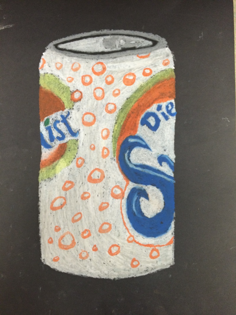
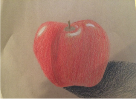
Up next were the oil pastels. Instead of an apple to draw we had a soda can. There's not really any value in this drawing, but I tried to get all the details in that were on the can. I'm happy with how this turned out, but if I were to add a light source and a shadow then this would have been looking ten times better. Lastly we have the colored pencils. The major thing we learned with colored pencils are to go lightest to darkest because it's harder to add a lighter value on top of a darker value. I'm very happy with my light sources, but I wish I would've layered more red to make it more vibrant.
|
Unit 2 Project, Up Close
For unit two we had to select something of nature and get an up close picture of it. The whole point of the project was for our pieces to be abstract, and mimic the style of Georgia O'Keeffe who made abstract and up close pieces. My ten ideas were kind of basic and generic (flowers, fruits/vegetables, or an eye), so I decided that my top two ideas were going to be tree bark and a bubble. Overall, I ended up picking the tree bark because it would give me more of a challenge (which it did). The mediums that we had to choose from were watercolors, colored pencils, or chalk/oil pastels. I chose to do my project in colored pencil because the chalk pastels were giving me a hard time.
|
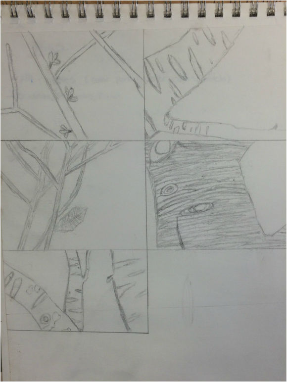
Here are my compositional sketches for the tree bark. I experimented with different sizes, shapes, and textures of tree bark, and I ended up drawing a thick and rough tree to challenge me. Also it would've been more interesting for me to do something with more texture.
|
|
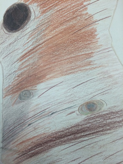
Here is my final sketch fir the project. I had to stop mid-way through because i wouldn't finish my final project in time. I mostly wanted to experiment with the colored pencils to see how I would like them.
|
|
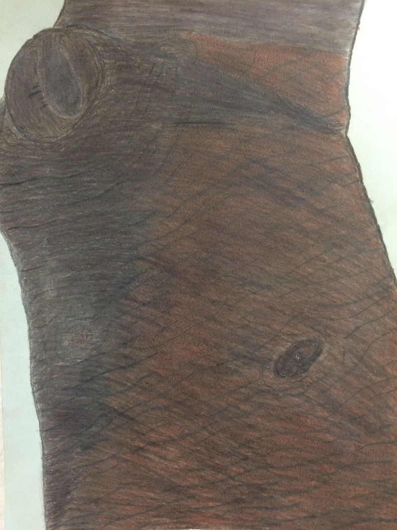
Last, but not least here is my final project. I primarily used different shades of browns, and gray, black, and white. I layered my browns going from lightest to darkest in order to achieve the color that i wanted. It worked out pretty good in the area on the left, but that whole right side didn't turn out to be that good (as you can see). Overall, I hated the way it turned out. The only thing I like about this is the texture in the tree bark. In the middle I wish the it was a little darker. The advice/critique that I gotten from my peers and teacher are to add a light source and also go in the direction that the grooves in the wood are going.
|
Clay Foods
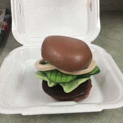
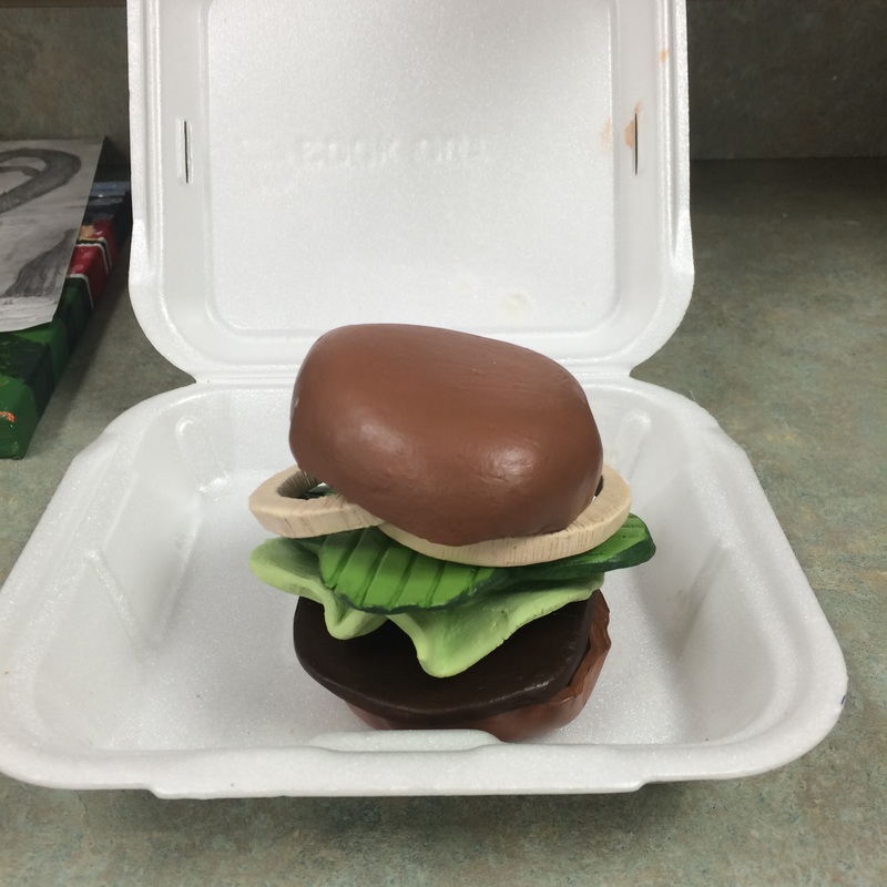
For this project what we had to do is pick any food that we wanted and make a clay replica of it. Originally I picked a baked potato, but it was giving me problems so I switched my food to a cookout tray. In the tray I was going to make the burger, onion rings, and a corn dog, but I ran out of time so I ended up just making the burger.
|
|
In the slideshow above you can see my clay pieces (onions, pickles, patty, lettuce, and the buns). Making the buns was easy, all I had to do was make a pinch pot. With the patty, pickles, and onions I make a slab and cut out the shapes that I wanted. Also with the pickles and onions I made grooves in them to get some texture. However, I wish I would've put some texture on the patty. The lettuce ended up not being good because I rushed them.
|
Painting the pieces was not that bad. I ended up enjoying that the most because we had to only use primary colors (blue, yellow, and red) to make the colors that we needed. It gave me a challenge, but I learned a lot from it. Making the bun color was hard because it was a kind of dark/tan fleshy color, so what I ended up doing was making pink and adding deep yellow to it. With the pickles I made two shades of green, one light green and one dark green. The reason why I made two greens is so that I can paint the inside of the pickle the lighter green, and the outside of the pickle the darker green.
|
|
Overall, I'm happy with the way it all turned out. The only thing is that I wish that I would've put more color in it by adding a bright red tomato, or instead of making the onions grilled make them raw purple onions.
Paint Like An Artist
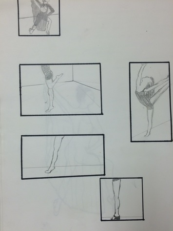
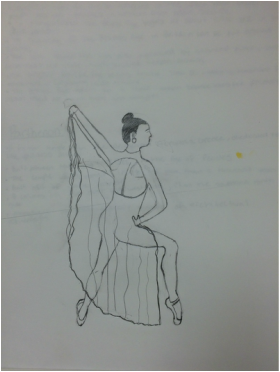
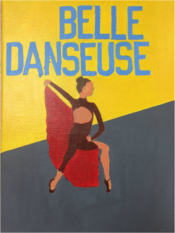
For this project we had two artist that we were given to us. My artists were Henri Rousseau and Henri Toulouse-Lautrec. We did research on each artists and looked at the paintings and how the artist painted them. We had to imitate the artist's style. I decided to go with Henri Toulouse-Lautrec.
Henri Toulouse-Lautrec painted pictures of people in bed, he made posters for plays, and painted pictures of dances and events.
Below are my compositional sketches and my final sketch
Henri Toulouse-Lautrec painted pictures of people in bed, he made posters for plays, and painted pictures of dances and events.
Below are my compositional sketches and my final sketch
|
|
For my painting I decided to paint a poster someone dancing. What Henri Toulouse-Lautrec did was he would use french words (because he's french). I chose to write beautiful dancer in french which translates to Belle Danseuse in french.
Printmaking |
Overall, I'm kind of happy with the way it turned out. This my first ever painting that I've done so I'm proud of myself for not messing it up. My biggest problem was getting the paint inside of the lines for the letters. I used tape to help me with it, but the paint got underneath the taped. Also a hard part was getting the right flesh color. I mixed pink with the deep yellow and that worked a little, but it wasn't the right color I needed.
|
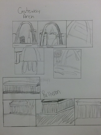
For our last project of the year we did print making of a historic era, landmark, or site. We also did some research of two things from a historic age or landmark. I ended up doing the Bronze Age and the Parthenon. The Bronze Age is the second part of three-age system for classifying and studying prehistoric societies of the Mediterranean. It also was commonly used for weapons. The Parthenon was originally built in Nashville, Tennessee for a 1897 Centennial Exposition. The Parthenon was actually built for the goddess Athena around 438 B.C.. Last year in Art 1 I did a printmaking project, and ended up not enjoying it that much. However in eighth grade I also did a printmaking project and absolutely loved it. It was my only good artwork in the class.
I decided to do The Parthenon because I've seen the replication in Nashville, and it would be cool to get some texture because of how old it is.
I decided to do The Parthenon because I've seen the replication in Nashville, and it would be cool to get some texture because of how old it is.
|
Here are my compositional sketches for The Parthenon. My second option was the Gateway Arch in St. Louis, Missouri. I've been to both of these landmarks and really enjoyed going to them, so that's why I chose these as my top two options
|
The colors that I decided to go with were baby blue, light green, baby blue with a hint of red, regular blue, and purple. When I originally chose these colors I wasn't so sure about them, but they ended up working well together. The color paper I chose was orange so it can bring out the blue's.
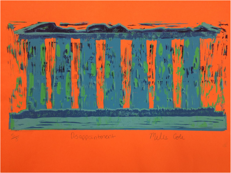
I'm happy with the way it turned out, however all of those little lines on the print aren't meant to be there. I just needed to trim those off, but I kept on forgetting. The green is there to add texture and I also just wanted to add another color.
