|
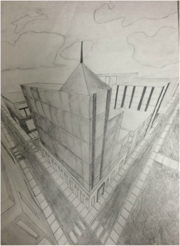
This is my most successful project in art 2. It was the first project of the semester and we had to do a perspective drawing in pen and ink. I decided to do pencil because I was afraid to mess up doing ink. For the drawing I chose to do Downtown Raleigh. My struggles throughout the drawing was erasing some of the small little lines that overlap and the texture of the grass on the bottom right hand side. When I was doing the drawing, towards the end I noticed that I had a huge empty spot so I just added grass. I didn't know how to draw the texture of grass so I just winged it. Looking back I could've asked for help, but it didn't turn out too bad.
|
|
|
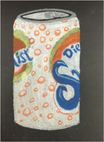
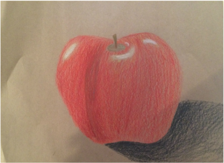
These two mini projects that we were doing in class were extremely beneficial. The soda can on the left taught me to layer and capture values. It was tough getting some detail in the drawing because the oil pastels are so big, it's to hard to get the small things. I tried getting value in the drawing, but it was a little difficult because whenever I would use the gray it would make the shadow look unnatural so I would just go over it with more white. Also, doing the lettering for the word "Diet" was hard because like I said before it was difficult to do small little things due to the oil pastels being big. The apple drawing taught me how to capture all of the values using different colors and layering them to get the right colors. We painted/drew a lot of apples this semester to get practice using the different mediums. The light source of this apple is spot on in my opinion, but the shadow could be better. Somethings that were a little hard for me was layering the colors to give it that depth and vibrancy and using more darker colors to give it even more depth. But overall these two mini projects have taught me to use colors, besides black and white, to get more values.
|
|
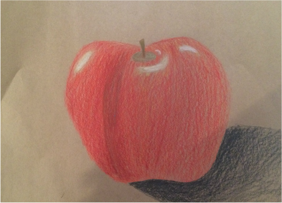
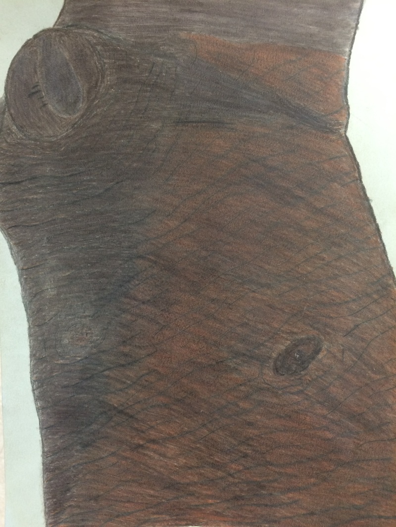
These two pieces show my growth throughout the semester. Practicing using colored pencils by drawing apples gave me a feel for colored pencils. It also gave me a little practice doing value and layering. Even though the drawing on the right wasn't my best project, it still shows the growth that I've had. I did a lot of layering and added texture to the tree. I also used different colors other than black and white to get more value. I didn't have a light source and my shadow was too dark. However, I added texture and added depth in the grooves of the tree by adding different colors.
